Sunday 31 January 2010

USDSEK - Further evidence of USD strength to come


Above is a weekly chart of USDSEK. I have detailed what I see as a weekly diamond formation which typically leads to sharp counter moves. With stock markets likley in a corrective phase, this bodes well for further dollar gains over time. Initial targets, as detailed on the chart image are, 7.7390 and then 8.0430. Please note this is a weekly chart so things may take time to evolve, if indeed I am right!

Saturday 23 January 2010

World/emerging ratio - One to watch during a deleveraging period


Above is a chart that I have shown on this blog before. It basically divides the value of the Morgan Stanley World index by the Morgan Stanley Emerging index. This is shown at the top of the chart. Below are the world and emerging indices. Click on image for a larger chart.

It is clear, from what data we have, that during bullish phases in equities the ratio rises, so emerging outperforms. Converely during periods of equity weakness emerging markets underperform their developed world cousins.

Now if you believe that we are in for a new wave of deleveraging then there is a greatly increased probability that the ratio heads south, ie emerging underperforms. There is no such thing as decoupling. At the very best a variation of decoupling may take place over decades where the ratio always peaks at higher levels and forms higher lows at higher levels. It remains to be seen if this is the case.

JALSH - Breaks multi-month rising trend and leaves a false break higher


Quite a nice example of an emerging market that looks like it is set for a larger correction then we have seen of late. As can be seen in the chart above the JALSH has broken both the multi-month rising trend-line and in doing so has left a false break higher. This now warns of the possibility of sharp losses ahead. Similar to the indian stock market, most emerging markets are well overdue a big correction. Just another warning sign.....

Friday 22 January 2010

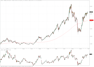
Dow Jones Industrial Average - Chart pattern similarities with the 1929 crash


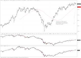
Ok here is one to scare anyone who is still sober on a Friday night. Take a look at the two screen shots of charts above (Click on images for a larger picture). The first one shows the extent of the retrace that took place after the crap out in 1929 (just over 50%) and the second one is what has happened since the peak in 2007. As you can see we have retraced just over 50% again.
I appreciate that the two moves took place over different lengths of time but the patterns are very similar and also relate to two very similar periods of market excess.
For what it's worth I am in the large correction downwards camp and cannot rule out a break of the low. If an industrialised government bond issuer defaults (Japan), anything can happen. Bond yields don't need to rise too far there for the entire tax receipts to be exhausted paying interest on outstanding debt. Scary. I'm sorry to bring it up on a Friday night! In any case it may not even be a top yet but still interesting...

Saturday 16 January 2010

EURGBP - Approaches a great risk reward region for long entry


As can be seen in the chart above, EURGBP has been correcting off the recent .9413 high, as it has appeared that all is not well in the Eurozone. In particular yesterday saw claptrap about Angela Merkel resigning! This was just stop hunting. I have a good idea where this rumour was probably generated. The good part is that it has taken EURGBP back into a great risk reward zone. While above .8705 this pair remains bullish from a structural standpoint.


From a fundamental approach we are all familiar with the trouble in Greece and with Greek government debt. To put it into perspective consider that Greece is responsible for 3% of Eurozone GDP. Spain and Ireland are old news too, with Ireland looking like it is willing to take the appropriate steps to improve its fiscal position. Now contrast this with the article from the FT via Naked Capitalism.


The probability of a sterling crisis, in my opinion, is much higher then is priced into the currency markets. Over the last 18 months private debt has been passed over to the public sector as governments in most industrialised nations (and the UK in particular) have bailed out their bankng sectors and supported other sectors. This is why there is so much emphasis on sovereign default probabilities. What has taken place is that the debt has just moved around from private to public bodies, but it has not really gone down. Deleveraging is alive and well. Don't forget the UK is loaded to the brim with civil servants. The state is one of the largest, if not, the largest employer. So now it is time for austerity when half the nation gets its pay check from the state! To my mind EURGBP back at .9805 or parity makes a lot more sense then back in the old range near .6500.

I would recommend getting long on the approach to .8787 with a stop under .8705. Great risk reward.

Nifty 50 - Market sentiment is always most bullish at the top


Its is said a picture speaks a thousand words, so above I present a picture I have become quite fond of. The nifty is shown in the upper portion of the image with the p/e showing at the bottom.
Now, if there is anyone that can justify to me that there is any value in the Indian stock market then please let me know (seriously, send me an e-mail). The only times that the P/E has been higher then it is today was in the bubbles of the tech boom and the one that was driven by the biggest credit bubble in the history of the world, in 2007. I can only repeat the sentiment from my previous post. If you are a long term investor who likes to sit on value based positions, this is highly unlikely to be the time to invest in Indian equities.
I have read countless articles about the way retail investors are piling into emerging markets and Indian equities in particular. Remember:
1. Market sentiment is almost always most bullish at tops. It must be to get the greedy to buy
2. There is no such thing as decoupling.
Mind how you go....


Happy New Year

I have had an extended break and am now well and truly settled into my new role. I seem to be forever apologising for not updating this blog, but then if time does not permit? As always I start this new year with the best intentions to update more frequently. Lets see what happens.

The first article that I am going to present will give a good indication of my bias for the year ahead. As followers of this blog will know, I am a medium term dollar bull as per my earlier post. I see Aussie dollar bulls as mindlessly following a momentum trade that reminds me of the emerging market madness just before the crap out in 2008. With that in mind take a look at the following:

http://digitaljournal.com/article/284509#tab=comments&sc=0&contribute=&local=

Remember which nation was once the biggest borrower in the world? Look what happened to them. YOU CANNOT BORROW YOUR WAY TO PROSPERITY. Australia, and China for that matter, are ticking time bombs. As a trader I would say have your fun. But depending on what you are trading you may be engaging in the greater fool theory. It never ends well, remember Japan.... As an investor I would say get out of risky positions (particularly in Australia) and book what profits you have. There are far better investments out there.

I intent to update a couple of times today so do come back for more.....